Predicting The Wave Before It Breaks
Improving traffic forecasting with spectral state-space models.
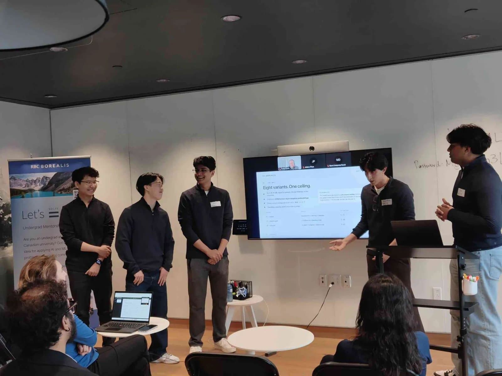
Traffic forecasting asks a model to anticipate how a slowdown will travel through a road network, not simply extend a single sensor’s recent readings. With RBC Borealis, we investigated whether spectral representations could offer a more useful view of how those connections shape future traffic.
The question we started with
Knowing that a road is congested is useful. Knowing what it will look like an hour from now is much harder. A slowdown can travel through a network, and a sensor’s recent readings only show part of what is happening.
For our project with RBC Borealis, we studied whether a model could make better forecasts by explicitly representing how roads connect. We worked with METR-LA, a dataset of 207 freeway sensors in Los Angeles, sampled every five minutes. The task was to take the last hour of readings and predict the next hour.
We evaluated predictions at 15, 30 and 60 minutes using masked mean absolute error, or MAE, in miles per hour. It measures how far predicted speeds are from the observed speeds, excluding masked readings. Most of our attention went to the 60-minute forecast, where the errors were hardest to reduce.
Why the first approach stalled
We started with a SpectralMambaReal baseline that scored 4.18 MAE at 60 minutes. Its basic idea was to transform sensor readings into graph frequencies, process those frequencies with Mamba, then use a Transformer-style readout to predict future speeds.
The graph Fourier transform gives the model a different way to see the road network. Low graph frequencies describe patterns that vary smoothly across connected sensors. Higher frequencies capture sharper local differences. We also explored running Mamba along the graph’s frequency modes, rather than only along time.
But the early experiments kept landing in roughly the same place. We tried deeper models, wider channels, adaptive embeddings and different decoders. The original variant scored 3.72, an adaptive version reached 3.68, and a fuller version reached 3.69. More capacity wasn’t moving the result enough.
Our working diagnosis was that the fixed, truncated graph representation was limiting what the model could learn. Changing the decoder still left us close to 3.7, so we changed the foundation.
A stronger baseline changed the direction
We turned to STAEformer, which learns embeddings for sensors and time of day, then combines them through temporal and spatial attention. That lets it learn recurring patterns without being given a fixed road adjacency matrix.
Our reproduction reached 3.339 MAE, close to the paper’s 3.34 reference value. Averaging four independently trained models brought that to 3.290. Adding ST-TTC, a small test-time calibrator, reduced it to 3.283. A larger pool of 24 models, with selections for each forecast horizon, produced our best internal result of 3.2603.
The distinction matters: the best METR-LA numbers came from ensembling and calibration. They weren’t evidence that our new spectral architecture had beaten the baseline on its own.
How the METR-LA results changed
60-minute masked MAE (mph). Lower is better.
Giving the model three views of the road
STAEformer was strong, but it learned road relationships indirectly from the data. We wanted to test whether explicit structure could still add something useful. We kept a frozen STAEformer backbone and built a separate branch that learned a correction to its forecast. We called the hybrid STAE-Spectral-Magma.
That branch represented the same network in three different ways:
- Geographic
- Which sensors are close on the road network? A symmetric Laplacian captures the network’s physical structure.
- Directional
- Which sensors are upstream or downstream? A magnetic Laplacian uses complex-valued eigenvectors to represent direction.
- Behavioral
- Which sensors behave similarly, even when they are far apart? A learned graph connects sensors using their embeddings.
Each view had its own spectral basis. Bi-axis Mamba processed information across time and graph frequencies, while a small mixture-of-experts router chose how to combine the views for different regions and forecast horizons.
How the correction joins the forecast
A simplified view of STAE-Spectral-Magma.
Base forecast
Learned correction
Where it helped, and where it didn’t
On PEMS-BAY, a second traffic benchmark, the hybrid reached a validation MAE of 1.550, compared with 1.580 for the STAEformer baseline. A larger STAEformer control scored 1.583. That was encouraging: simply making the baseline larger hadn’t reproduced the gain.
Our hybrid had 2.08 million parameters, slightly more than the original baseline’s 1.95 million and fewer than the larger control’s 3.45 million. The result supported the idea that the added structure could help on this dataset.
Adding capacity didn’t explain the improvement
PEMS-BAY validation MAE against model size. Lower is better.
View exact values
| Model | Parameters | MAE |
|---|---|---|
| STAEformer | 1.95M | 1.580 |
| Larger STAEformer control | 3.45M | 1.583 |
| STAE-Spectral-Magma | 2.08M | 1.550 |
On METR-LA, the same branch didn’t improve the result. Other experiments were disappointing too. Scanning across frequency modes gave only marginal gains. Gaussian negative log-likelihood performed worse under the MAE metric. A Laplace loss addressed part of that mismatch but didn’t deliver the improvement we hoped for.
We also used an oracle analysis to ask a narrower question: could the spectral basis represent a useful correction if we already knew the ideal coefficients? That helped separate what the representation could express from what a model could predict using only an hour of history.
Our interpretation was that STAEformer already captured much of the structure we were trying to add on METR-LA. The experiments pointed toward limits in the available information, though they don’t establish that no future model could do better.
Takeaways
The most useful part of this project was having to change our minds. When several versions of an idea give nearly the same answer, there’s a point where adding another layer stops being the most interesting experiment.
We came away with stronger ensemble results on METR-LA and a spectral correction branch that improved PEMS-BAY validation performance. Just as valuable was learning to keep those outcomes separate, and to explain the experiments that didn’t work as carefully as the ones that did.